Building a personalized farmacy of the future
Apothékary is a plant-based farmacy offering natural alternatives to synthetic drugs and beauty products. They believe that self-care is the new health-care.
Apothékary was started by Shizu Okusa as a little side experiment in 2018 while she continued to operate her JRINK Juice retail ops in the Washington DC metro area. Using her existing retail channel, she introduced Apothékary herbal supplements to her customers and they loved it. They quickly expanded to pop-ups, storefronts, and ecommerce.
By Sept 2019, Shizu knew ecommerce was the future, and decided to invest heavily into growing out her ecommerce ops. Shizu and I were connected while I was exploring a new retail project, and we agreed to swap advisory help: her retail experience for my ecommerce experience.
Taking a bet on personalization
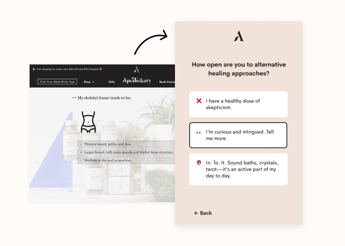
Shizu had a hunch that visitors that took her Ayurveda-focused product recommendation quiz were converting better than other visitors, but we didn't have great data.
We wanted to bring to life the very human interaction of someone walking into an herbal supplement store, and talking with the wise, kind store clerk that would listen to a person's problems and recommend the perfect blend of plants to help them heal and grow.
Together with Shizu's exceptional team, we outlined a high-level strategy to help us bring the vision to life to serve customers better:
- build a great personalization quiz to help visitors learn about themselves;
- streamline recommended product offering to give visitors a more direct path to checkout; and
- funnel visitors to the quiz via email campaigns, paid acquisition, and social content, speaking to the ayurvedic curious (less the skeptics or the already "woo woo" deep.)
I was brought in to design and build their new personalization funnel. We had two important tactical goals that would push our high-level strategy forward:
- Streamline the quiz so more folks would begin and finish it, and
- Update the results page to boost conversion
Designing personalized farmacy quiz experience
Our first order of business was information architecture + interaction flow for the quiz. We were able to chop out unnecessary pieces, and re-arrange the quiz to build momentum so more folks would start, and more would finish.
I then worked through flow sketches → wireframes → basic mocks for the quiz experience and the results page. I was able to tap Apothekary's contract brand designer for high-level feedback at key points in the process.
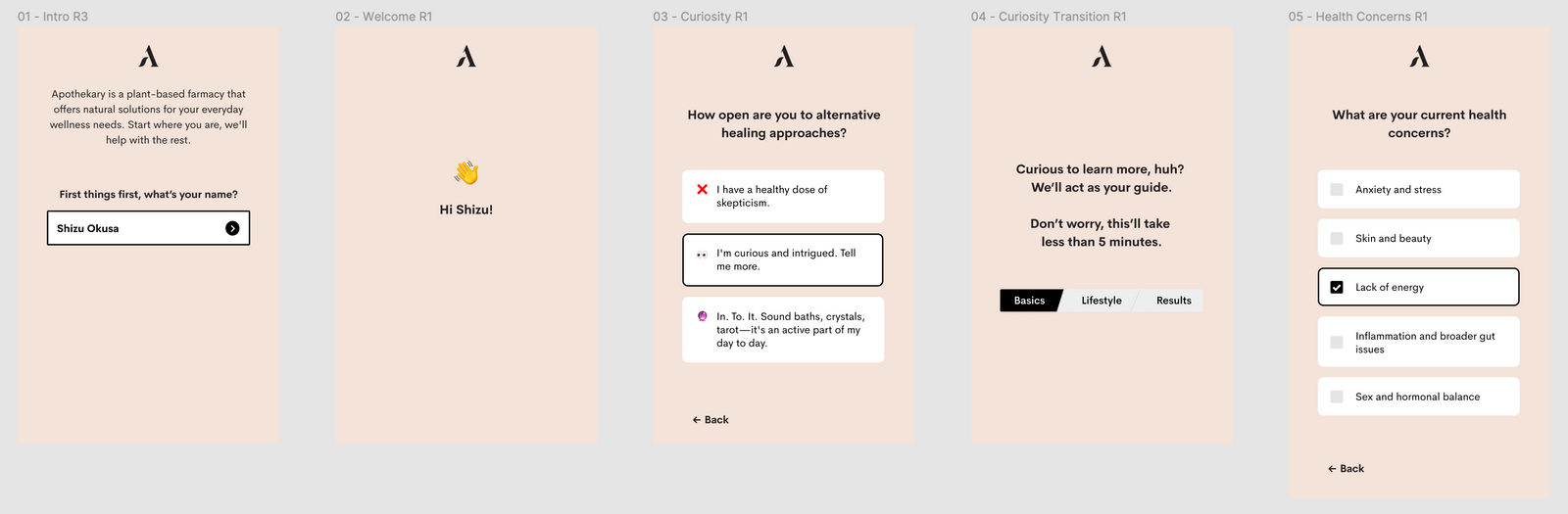
Another important piece of the experience—meant to lift conversion—was speaking to a wider audience. Collaborating closely with their marketing team, we moved away from language deeply rooted in Ayurveda, and towards copy that's more approachable for wellness-seeking digital natives today.
We evolved Apothekary's visual aesthetic just a tad: simpler, less colors, less type variation, more noticeable calls-to-action, more emphasis on standardized product photography. And of course, the entire experience was designed responsively, with mobile-first since most visitors found their way to the site through Instagram on their phones.
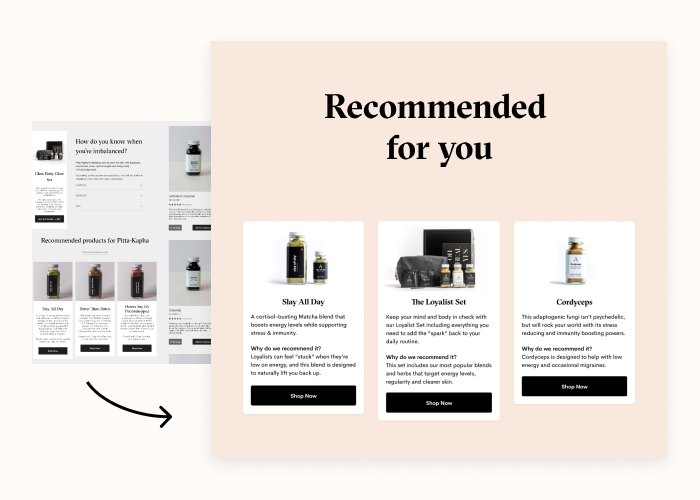
Streamlining the Results page was another key objective. After taking the quiz, visitors were sent a results email + redirected to a results page showing them their Dosha type, what it meant, and how they could use it to improve their health. This is where we recommended products based on how customers responded to questions in the quiz. Before the project, this page was unfocused, with at least a dozen recommendations. Afterwards, we tightly focused in on just 3 products: 1 package, 1 blend, and 1 single herb. Our hypothesis was that fewer choice would lead to more direct action (products to carts → checkout conversion.)
Making it real — web engineering
On the web engineering side: I worked on technical discovery with Apothékary's contract web engineer, and we decided to build a custom React single-page app that integrated with Typeform to handle data collection + result routing.
For this React SPA quiz build, I helped Apothékary find a remarkable contract web engineer so we could hit our timeline of Q1 '20. I managed the engineer throughout the project, and directly contributed code related to aesthetics, design polish, and a few adjustments to the controller + logic components after we shipped v1 and learned from the first week of activity.
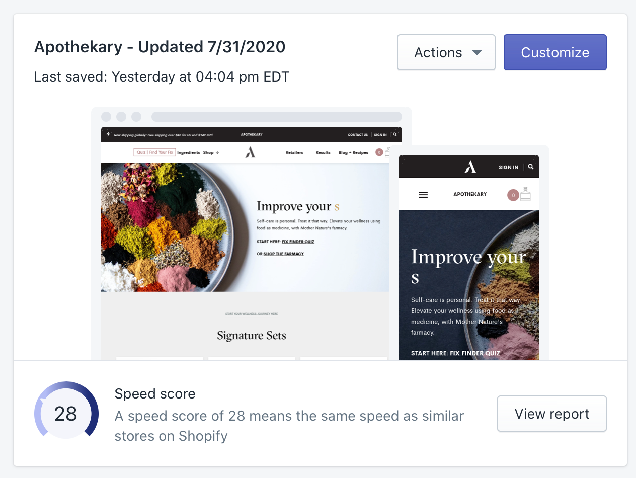
For the Shopify build, I handled that myself, and worked to modify their existing site template. I ended up devising best practices for local theme development, code check-in with GitHub, and deploying strategies to avoid loss of data when other users edited content via the Shopify CMS. This development workflow was a beast to figure out, since Shopify has so many little nooks and crannies that they've done in a custom way.
Metrics and Analytics
Shizu and team were heavily focused on being data-informed. That meant setting up a suite of metrics and analytics to help guide the way. I planned out a focused analytics architecture, using Mixpanel and custom events to put together reports for the most important visitor behaviors. I took care of dashboard instrumentation, and put together reports for funnel conversion, quiz vs non-quiz takers, which Dosha-type resulted in highest conversion, and other metrics that helped guide product and marketing strategy.
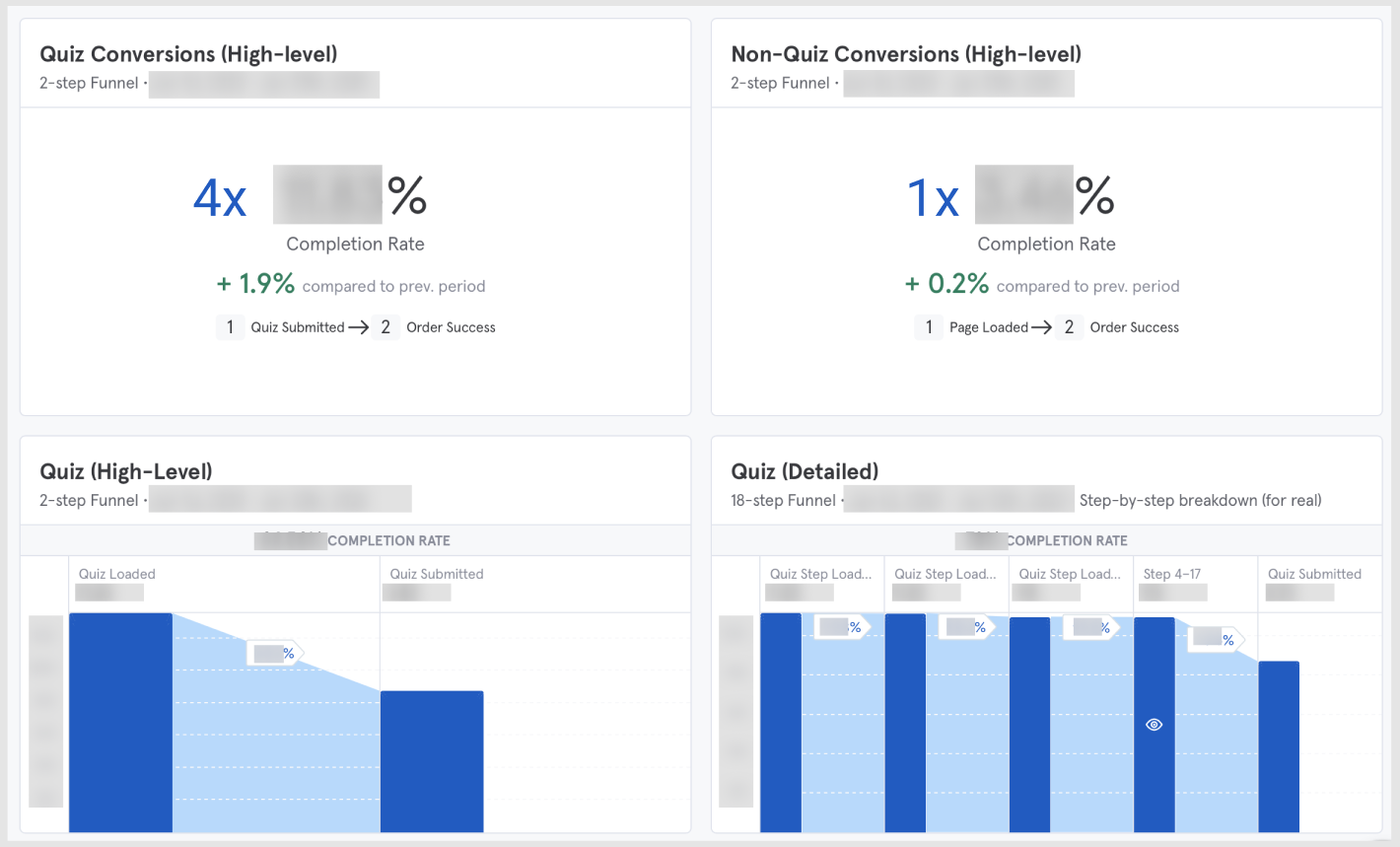
After shipping, we paid close attention to the data and customer feedback. One important validation was that quiz takers were ~4x more likely to convert than non-quiz takers! This little nugget helped shape marketing strategy for the next quarter, and led to Shizu's team producing incredibly impressive results.
Key Results
My work was part of a larger marketing puzzle, and together we were able to increase revenue by ~600% from before I started to after I shipped the quiz + metrics.
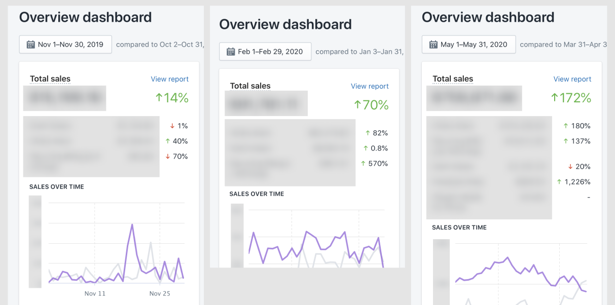
The Apothékary team then poured fuel on the fire by investing heavily in their email campaigns, paid acquisitions, and social content all designed to push people to the new high-performing quiz — in just 3 short months, they had grown ~46x (!) Wild.
Check out the live site here.