Scaling Power Supply to new markets across the country
Power Supply started with a hyper-focused product in a tiny niche (prepared meals + Paleo menu + Washington DC area.) We wanted to grow to fulfill our vision of easily accessible good-for-you food. To grow, we needed to learn if the model and product experience we developed in our first market would work around the country.
Background
I joined Power Supply in January of 2014, when they were just starting to blossom in the DC Metropolitan area.
Power Supply helped fuel active folks with tasty, good-for-them food by working with local chefs to prepare and deliver meal plans. We were the "easy button" for people who wanted to eat Paleo or Vegetarian, without the hassle of meal prepping, shopping, or cooking.
At the time, most of the product was manual-intensive. It consisted of a static Wordpress site, a few forms that sent emails to the right people, and LOTS of spreadsheets. They had just finished building a payment subscription system (before products like Stripe subscriptions), and the customer experience was pretty freaking bare.
I was brought on to build the foundational customer experience and the first stab at the complex machinery that made up the internal culinary and logistics software. Fast-forward a year—and tons of hard work—later and boom 💥, Power Supply was thriving in DC.
The Challenge
Since we'd proven traction in DC, our eyes were already set on the next goal: testing out our growth hypotheses. We thought we'd be able to replicate and scale our current model/experience in other cities.
There were plenty of leap-of-faith assumptions to test out:
- Would our product (prepared meals, paleo / vegetarian, subscription) resonate with the same customers in other markets?
- Could we find partners (from chefs to delivery crews) to work with us?
- How would pricing change in different cities?
- Could we adapt our product experience and systems to operate multiple markets?
After considering various factors, and running a few experiments, the first city we decided to target for expansion was Los Angeles. 🏖
The Setup (Goals & Objectives)
We kicked-off the project with a few goals:
#1 The core product would stay the same, but we needed flexibility to scale our offerings.
Our market in DC handled a pretty large volume of meals, with multiple menus, portion sizes, plans, and delivery methods (pickup + direct.) We wouldn’t be able to offer it all on day one in LA, and we didn’t want to—it was important that we learned which offerings would work best in different cities.
That meant we had to re-think every piece of the experience to account for flexibility in product offerings. We had to look at everything from how we talked about the plans and pricing, to how we showcased our network of independent chefs in each city. Oh, and the customer experience was just the tip of the iceberg: our culinary and logistics experiences also had to handle multiple cities with different offerings so they could share processes as we scaled.

#2 We needed brand guidelines to help us work more quickly and consistently as we grew.
We didn't have brand guidelines, and our style guide was geared towards print. If we were going to grow the team and expand to multiple cities, we needed to have a system in place to support all the folks that would touch every point across our customer's experience.
#3 We wanted our customers to have a consistent, unified user experience across our platforms.
At the time, Power Supply's systems were spread all over the place. There was a Wordpress site for marketing pages, one app for ordering, another app for managing your order, yet another app to keep track of meals, another one to ask for reviews of meals, and a bunch of manual pieces on the logistics end that used different systems. All this created a pretty rough break in experiences for a bunch of users (customers, internal ops), and it’d only get worse as we started operating in multiple cities.
We saw a path to integrating our systems so we could offer a much smoother user experience.
#4 We needed to launch by end of Q1 2015.
We needed to prove city expansion as a growth model to prep us for our next round of funding. We started investigating city expansion at the end of 2014, and started moving in Q4 2014. We had roughly 8-weeks to execute, so that our crew on the ground in LA could start prepping menus, logistics partners, and distribution partners. Customer launch was in 12-weeks. Talk about tight schedules!
Team & my role
Our company was small at the time, only ~10 folks rowing the boat. 🛶
On the product-side, we were tiny: excluding our founder/CEO and our CMO, it was just two of us. I was leading design and product experience; Kevin was heading up software engineering.

In typical early startup fashion, I wore many hats:
- product strategy (how do we get closer to our vision, given constraints from biz, customers, and team?)
- user research (why did people love us? What could we do better?)
- brand design (messaging, tone, copywriting)
- UX/IxD (flows, interactions, info architecture)
- Front-end dev (HTML/CSS/JS systems; Rails architecture)
- QA (end-to-end testing; roll-out strategy)
- Comms design (timing, customer + partner heads up)
For this initiative, we contracted two others to help strengthen our team in key areas : a brand designer for print & packaging touch-points, and a front-end developer to help us build the client-side.
The Process
You're probably familiar with the usual design process ... identify goals & assumptions, explore potential paths, lean on constraints to help make decisions, refine down, test, iterate, listen, repeat, etc. etc.
We did all of that here, but I want to highlight some of the more exciting parts of the initiative, unique to this business.
Working hand-in-hand with ops ⚙️ to coordinate launch timing.
We had to get the "back of the house" ready so that our ops teams could do what they needed to do: recruit chefs; test & iterate meals; prepare menus ahead of time to test assumptions about product demand in new market; and test runs through production cycles (checklists, labels, quantities, locations, etc) to train up new ops teammates.
I was responsible for the production and execution: identifying needs, ironing out a schedule that worked for all parties, designing + building the changes to handle multi-city ops, testing, training our staff, and iterating on the roughest spots. I had air cover from our CEO to smooth out the more gnarly timelines and requirements, and worked closely with our engineering lead to figure out how we were going to change the underlying production systems.
![Ops and logistics pieces - [Image of Garden + pick/pack room with checklists + label lists]](/images/case_studies/pse-pick-and-pack.png)
Coordinate branding & marketing across physical and digital mediums.
Until this point, we didn't mind that our physical/digital stuff was out of sync. But as we planned to scale, ✨ having consistent design across our experience became more important ✨ for the usual brand consistency stuff, but more important was the ability for us to pump out experiments more quickly across multiple cities to learn as much as we could about what worked and what didn't. 🔬
![Designing across media - [Image of PS designs across mediums - fridge, meal, landing page, email]](/images/case_studies/pse-cross-media.png)
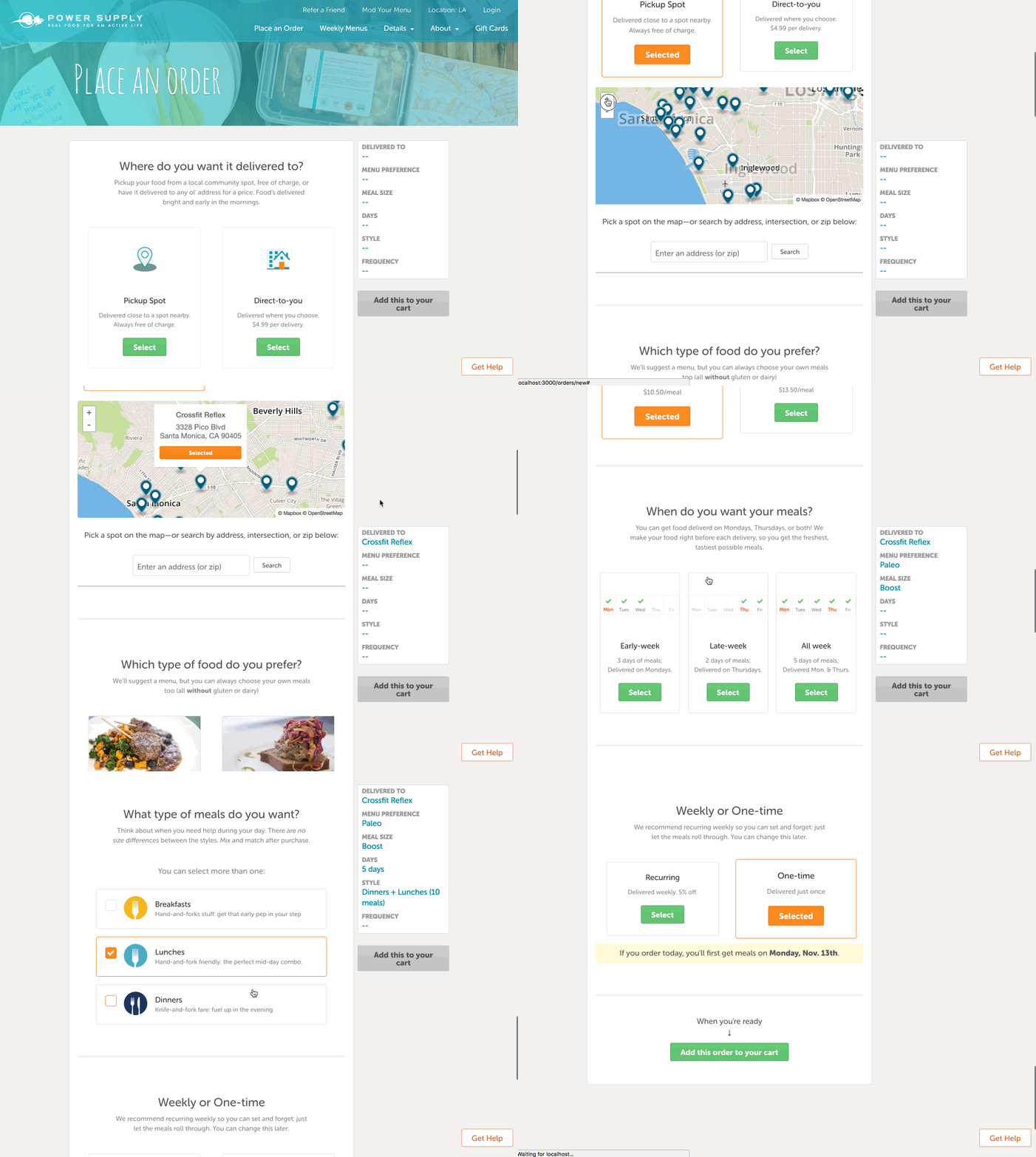
My focus was on the digital experience, where I spent most of my time thnking through information architecture, and breathing new life in the form of a digital style guide.
I was directly responsible for information architecture. It was a huge piece of the puzzle: how much could we keep generic across all cities? What had to be city-specific?. I spent my time sketching, wireframing, mapping flows, mocks (hand-in-hand with the digital brand work), and implementing the designs (I handled most of the front-end development.)
I worked closely with our CMO and brand designer to map out our customer journey, so we could identify physical/digital cross-over, and plan for things like a consistent meal rating experience ("eat meal, see CTA on the label, easily punch in URL, visit site, rate meal they just ate") or referral code redemptions. We shared WIPs so we could call out similar identity markers (e.g. iconography, gradients, copy tone) and make our work stronger together. I set us up with voice, tone, colors, web typography, use of photography, and layouts for both marketing pages + product/app flows.
Testing customer experiences with early partners.
Our core distribution channel was through local gym partners. In exchange for a commission of sales, they let us put a fridge in their gym where customers would pick up their meals. The gym community was a fantastic jumpstart for orders in a location (target audience + activated community == word of mouth referrals), so signing up location partners was an important part of expansion.
![A gym owner and a happy quote - [Image of gym owner + quote]](/images/case_studies/pse-gym-owner.jpg)
One of the ways we built a relationship with our "founding partners" was by letting them in on the building process. We asked them to be beta testers while we smoothed out the production process for the first few weeks. We took their feedback to heart, iterating quickly to nail down experiences until they felt it would be great for their gym members.
I worked directly with our "founding partners" to guide them through the process, listen to their feedback, and keep them updated as we improved.
Key Results
We successfully launched our first city expansion (Los Angeles) on-time. With each successive city launch, we layered on better ways to help us scale , to the point where our latest launch (in Dallas-Ft. Worth) was the smoothest, quickest, and most cost effective yet. We proved we could profitably expand our geographic footprint, which played a vital role in growth and future fundraising. Read more about city expansion.
We had our first digital style guide at the company (code name Rainbow Dash 🌈 🐴) + it’s front-end dev equivalent. The design system we built held strong for years (until our major rebrand to Territory.) It helped us build, launch, and iterate new features very quickly, with an incredibly small team. Customers were thrilled with the updates, and we raked in positive feedback across the board about our customer experience.
We achieved our integrated system , which has played a pivotal role in building such a smooth experience for our customers. It’s been the foundation that’s made a lot of our future work around personalized nutrition possible.
We've since re-branded to Territory, so there's no live site you can play with Power Supply stuff. That said, you can see all of this work in it's latest form on the Territory site.