Launching the Territory brand to accelerate growth
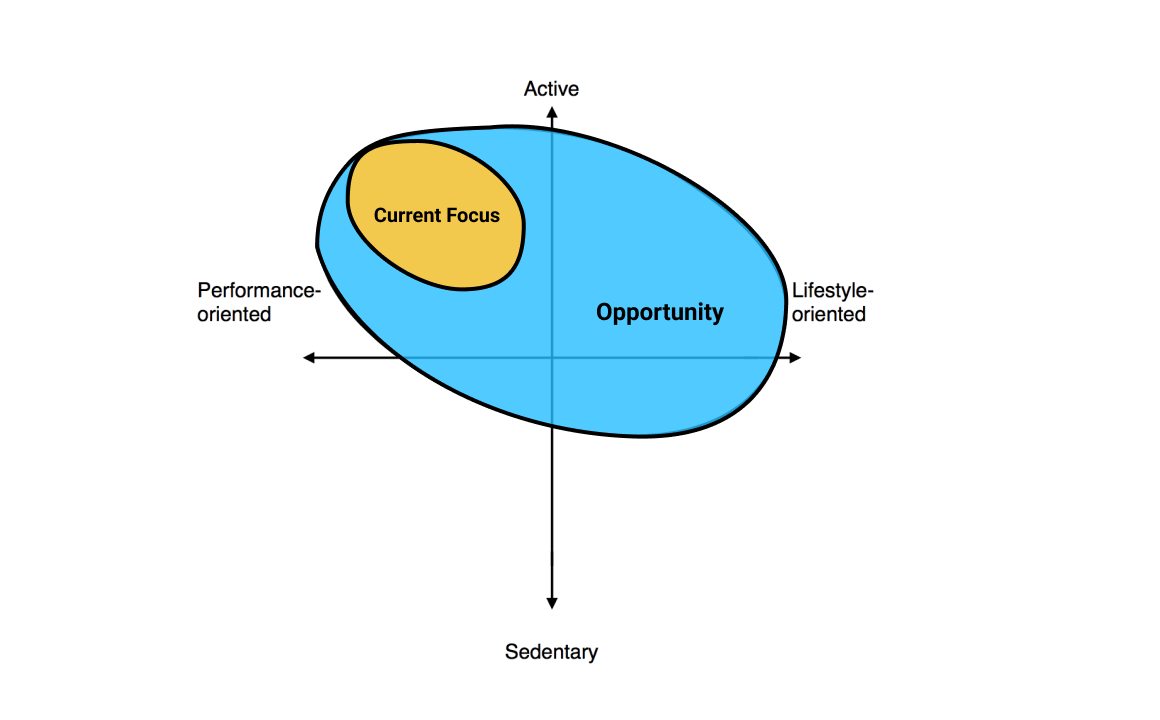
Power Supply was tailored to a performance-oriented, CrossFit/Paleo loving customer. As our business grew, we learned that there was an opportunity to position our brand beyond performance-oriented folks.
Background
Power Supply helped fuel active folks with tasty, good-for-them food by working with local chefs to prepare and deliver meal plans. We were the "easy button" for people who wanted to eat Paleo or Vegetarian, without the hassle of meal prepping, shopping, or cooking.
Through the life of Power Supply, we intentionally targeted performance eaters. We reached them through local communities—e.g. CrossFit gyms—where they spent their time at.
Our lexicon included words like "meal prep", "macros", "Paleo-friendly", etc. You'd find our community builders at theCrossFit Games hanging with pro athletes; posting videos of themselves finishing deadlift reps; and using phrases like "fuel for an active life" or "nailing a PR" (a personal record for the not-yet-initiated.)
But these performance eaters weren't the only folks who found our product appealing, useful, and irreplaceable.
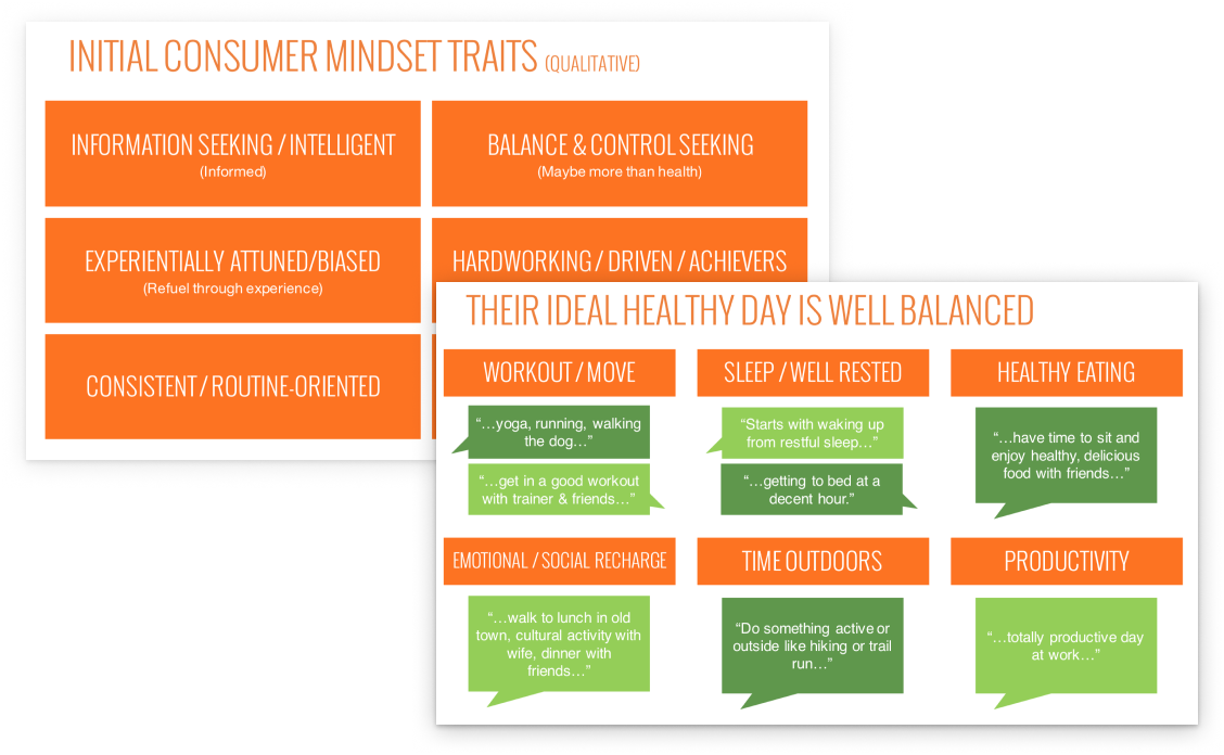
We were attracting other generally active, health-conscious achievers. These were folks who were constantly seeking adventure; folks who saw health as a holistic practice, each person with their own path to wellness.
Some were parents with no time to cook dinner, but still yearned for something that fit their health goals. Some were tired of the same crappy lunch they ate at the office every day. Some folks really enjoyed cooking, but couldn't find the time to do it all the time.
We uncovered a consistent thread running through all of our customers: we were an easy source of "personalized nutrition" for them.
What's personalized nutrition? Well, when it comes to health, what's best for me most likely won't be what's best for you. That's because everyone has a different way of eating, with different goals, different likes and dislikes, things they may be allergic to, foods they eat based on a moral philosophy, or different foods they grew up eating based on their ethnic backgrounds.
The way we built our product made it easy for folks to tell us how they wanted to eat, and then get that sort of food in a convenient way. We had the basics in place to serve the growing needs of personalized nutrition really well.
- Paleo, dairy-free, hold the tomatoes? ✅
- Low-carb, Mediterranean, small portions? ✅
- Vegetarian, without tree nuts, more than just salad? ✅
Folks were "hacking" at our offering, using some of the very basic tools we gave them to put together meal plans that uniquely fit them.
We believed that if we spoke more directly to personalized nutrition, that we'd be able to grow by leaps and bounds. It was time to chart our way through new territory, to set ourselves up for a future focused on personalized nutrition.
Objectives
We kicked-off the project with a few goals:
1. Position ourselves for personalized nutrition.
We believed that we could open ourselves to a broader audience by shifting from "performance eaters only" to "health-conscious achievers".
2. Level-up our design system for faster, more consistent production so we can experiment more quickly.
We were wrapping up an amazing 2016, and we had ambitious growth goals for 2017. We wanted to double-down on acquisition experiments, from cold-traffic online ads, to more targeted referral traffic from heavy-hitting influencers in our community.
Having a stronger design system would help us 1) encourage more folks to prototype ideas, 2) produce work much more quickly, and 3) have a better UX through consistent application of the brand across the journey.
3. Launch quickly enough to take advantage of growth initiatives.
Many of our growth hypotheses relied on us having a more inclusive product offering / brand, so we could fine-tune experiments to specific types of customers. That meant we needed a crazy fast turnaround time: 3-to-6 months, so that we'd be better positioned to find growth opportunities through the second half of 2017.
4. Elevate the perception of quality with the brand
Even though customers consistently raved about the food, they were less enthusiastic about the surrounding parts of the experience.
For example: we bundled our meal packs in saran wrap because it was cost-effective, it got the job done, and it felt raw/real... ← all feelings we wanted to evoke from our earliest customers. But new customers would get their meals and wonder "what in the world is this? why so much plastic? Ew."
We wanted to take this opportunity to level-up the way people perceived us, to reflect the incredibly high-quality nature of our food.
Team & my role
Our customer journey spans so many different touch-points, both physical and digital. Bringing a product experience to life around personalized nutrition meant considering the customer experience across that entire journey. That meant we needed to pull together teammates from every discipline:
- Our CMO Robert lead the charge, supported by our CEO Patrick, COO Jeff, and myself acting as head of product design.
- Our in-house design team (Trisha, Susie, Erin, Chris) spanning brand experience, print, copywriting, and UX.
- Our product + engineering team
- A special team (the "Branditos") of cross-functional folks: culinary, logistics, sales, customer support, people ops, etc. to make sure we’ve covered all touch-points, for both customers and our partners (e.g. chefs, gyms)
We also worked with external stakeholders throughout the initiative:
- Brand Intersection Group conducted the earlier customer + brand research. We worked with a small team of 2–4 folks.
- Red Antler helped us piece together our brand strategy based on the research, then execute on the rebrand (from naming to style guides.) We worked with a mid-sized team of 6–8 folks.
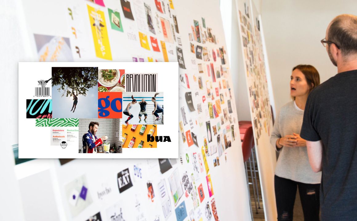
Oh, and did I mention we're a fully remote company? Yup. 🔮
As Head of Product Design, I worked closely with our exec team, brand partners, and our product teams to help define the brand strategy, and then bring the brand to life by executing details. I brought my deep understanding of customer needs, product vision, and technical constraints to make sure we built something great for our customers, that met our objectives and delivered on-time.
The Process
At the start of the project, I spent most of my time working with our stakeholders and partners to define the brand and coordinate the execution.
One of my important contributions here was streamlining the feedback/synthesis cycle so we could move super fast on multiple fronts, while keeping important folks in the loop. I was involved in ideation, feedback, and critique with the Red Antler team. We worked together in a nice ping-pong fashion: we’d come together, identify the next piece, they’d go away to execute, then they’d come back for a presentation. I’d take the presentation to our teams, collect and synthesize feedback, then bring it back to the RA team for consideration.

Once we had the brand principles and style guide in place, I was responsible for making sure all our teams were aligned. That meant sharing design principles and style guides with folks across the org. I fielded questions, and encouraged folks to solve their problems within the new brand guidelines. I directed many moving parts, from the look + feel of social campaigns, to the physical packaging production, to the architecture of our digital component library.
As the project peaked, I spent most of my time in-the-trenches, iterating on designs and shipping code. One of my important contributions here was making decisions about the difficult trade-offs on what we needed for launch, vs the bits we could iron out later.
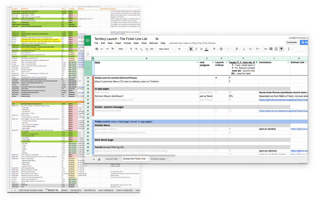
One of the most challenging parts of the rebrand was figuring out the balancing act of a "big bang" release vs pushing out incremental changes. Not only were we changing our brand, we also were shipping major product changes. We managed to test some of the product changes iteratively by releasing them under the old brand, while working on those features under the new brand behind-the-scenes.
The process had it's trade-offs. After launching, we learned that we missed a few key pieces that we should have caught sooner. But because we had the right systems in place to listen intently, we were able to act quickly, and the mistakes weren't costly. We also used this post-launch time to polish and fine-tune the more rough parts of the experience, and to layer in parts that we intentionally left on the cutting room floor to ship on-time.
Key Results
We achieved all of our primary goals: we positioned ourselves to as enablers of personalized nutrition, we supported future efforts by building a robust design system, we elevated perception of our quality, and we launched by the end of Q2 to set us up for our 2017 growth initiatives.
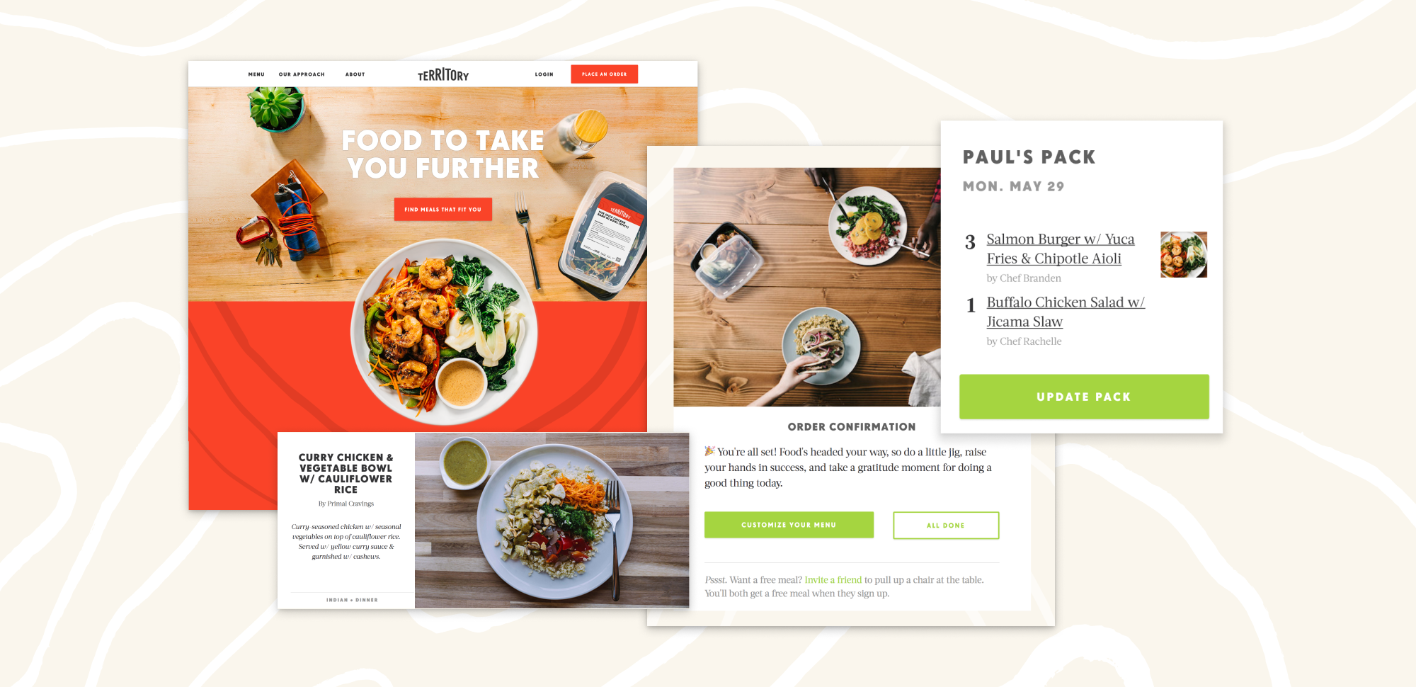
- A successful coordinated rebrand launch, across our entire experience, from physical touch-points (meal label, pickup fridges, brochures) to digital experiences (landing pages, menus, ordering, lifecycle emails, newsletters, and ads.)
- Strategic partnerships established—e.g. Whole30, Medstar Healthy—to highlight our emphasis on personalized nutrition.
- A flexible, consistent design system, including brand style guide, component library, and interaction patterns, across shared tooling (Figma, React library) set us up for much faster + higher quality product development.
- Positive impact to key metrics (conversion, referral, retention), inc. positive responses from customers about new inclusive menu offerings, and a huge bump in social sharing (finally, anInstagram worthy brand! -- you gotta watch this one.)
- Check out the site live here: Territory Foods (and get some free food on me via referral link!)